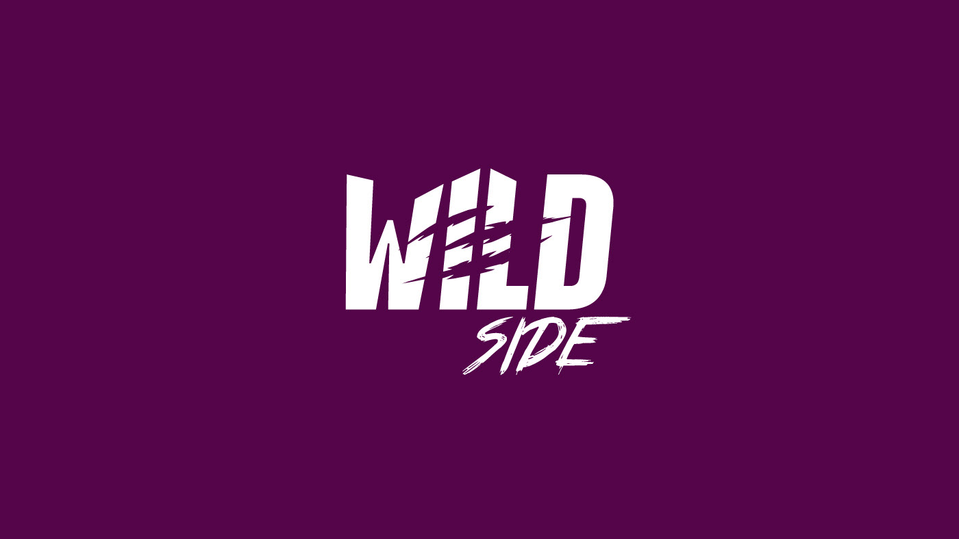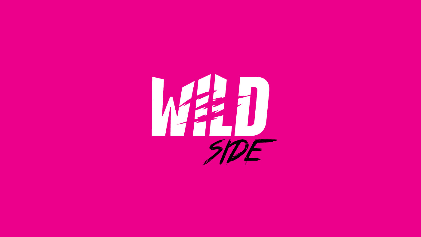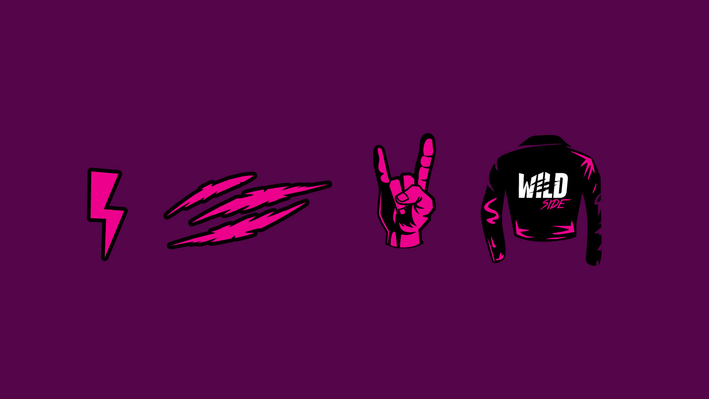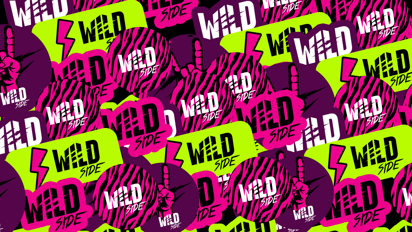
O projeto de marca Wild Side nasce da conexão entre Brasil 🇧🇷 e Estados Unidos 🇺🇸 , unindo instinto, estrada e atitude em uma identidade visual direta e sem concessões. O logotipo traduz o DNA da marca com força, impacto e tensão intencional. A tipografia em caixa alta, pesada e compacta impõe presença imediata, enquanto os cortes no lettering criam movimento, ruptura e energia bruta, remetendo à ação, ao atrito e a uma vida vivida em movimento. Nada está perfeitamente intacto, e isso é parte da linguagem.
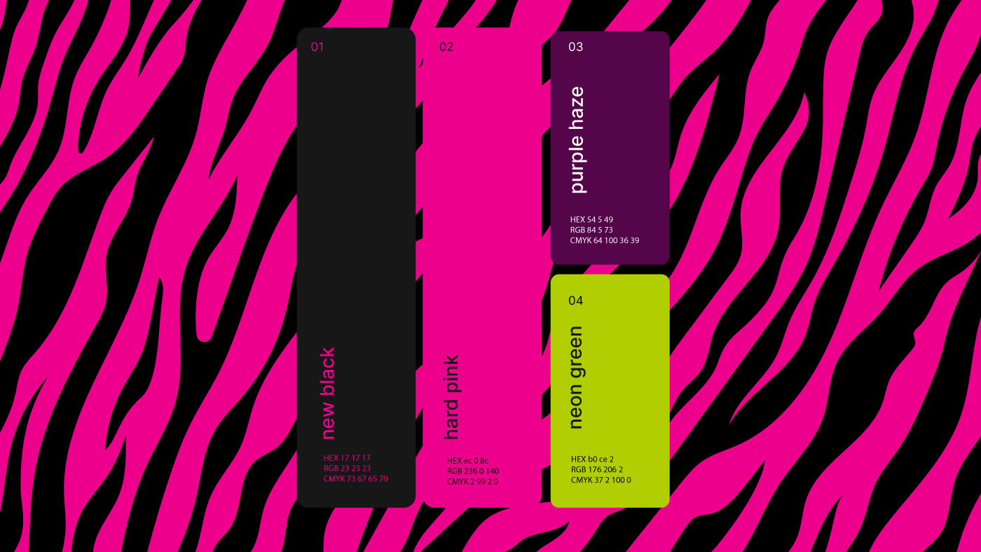
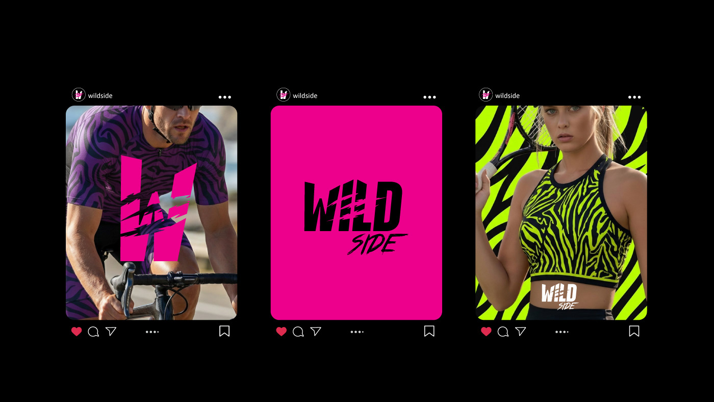
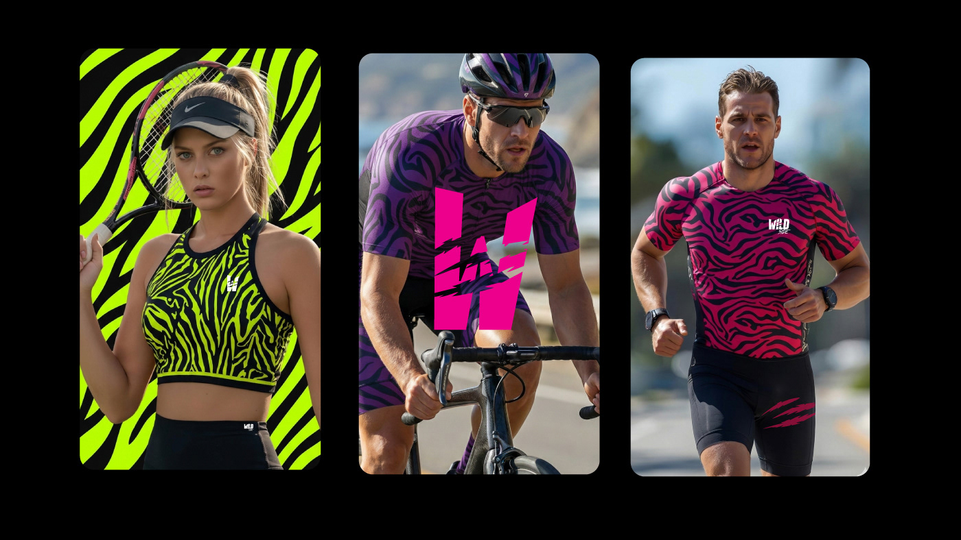
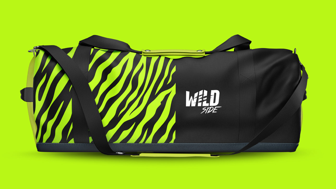
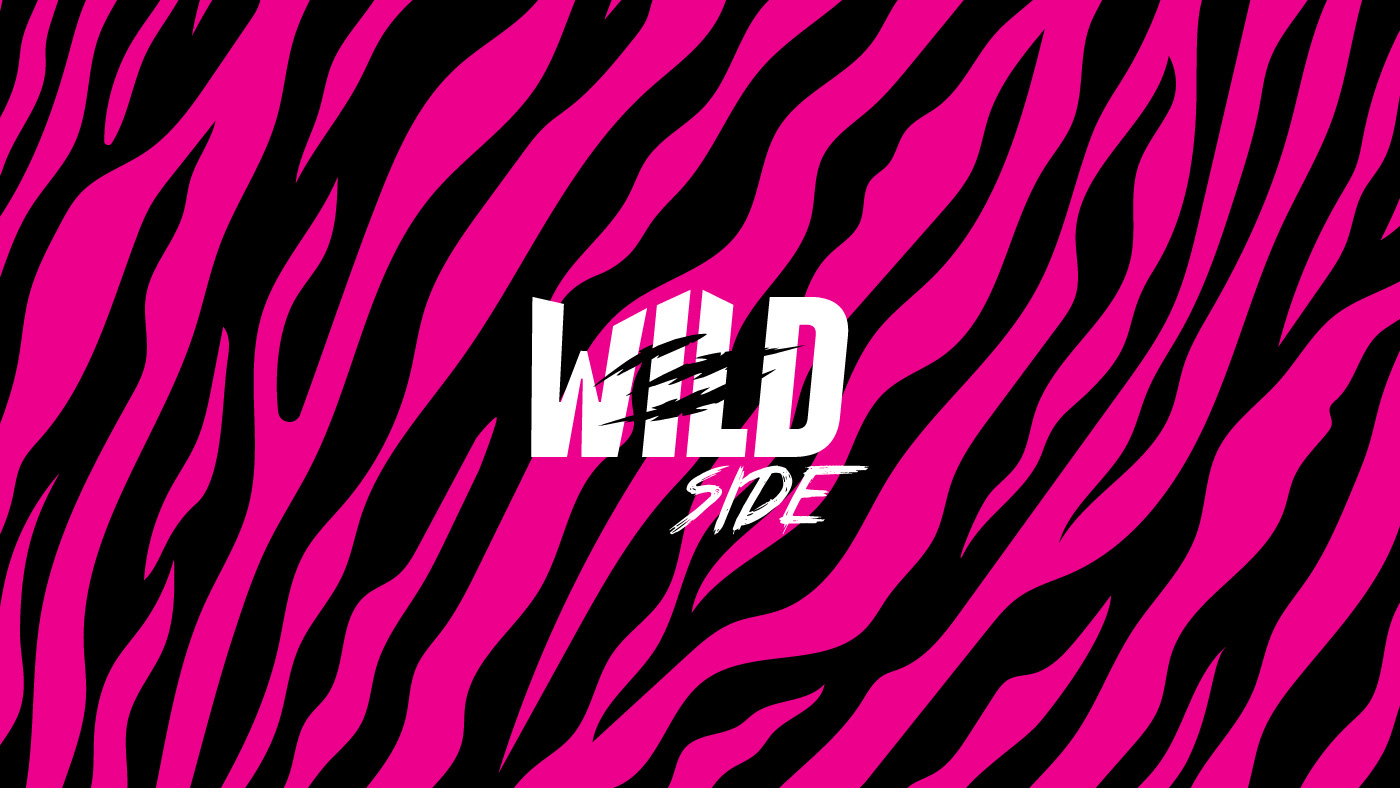
A paleta reforça essa narrativa por contraste e atitude, combinando profundidade, intensidade e ousadia em um sistema visual marcante, autoral e impossível de ignorar.
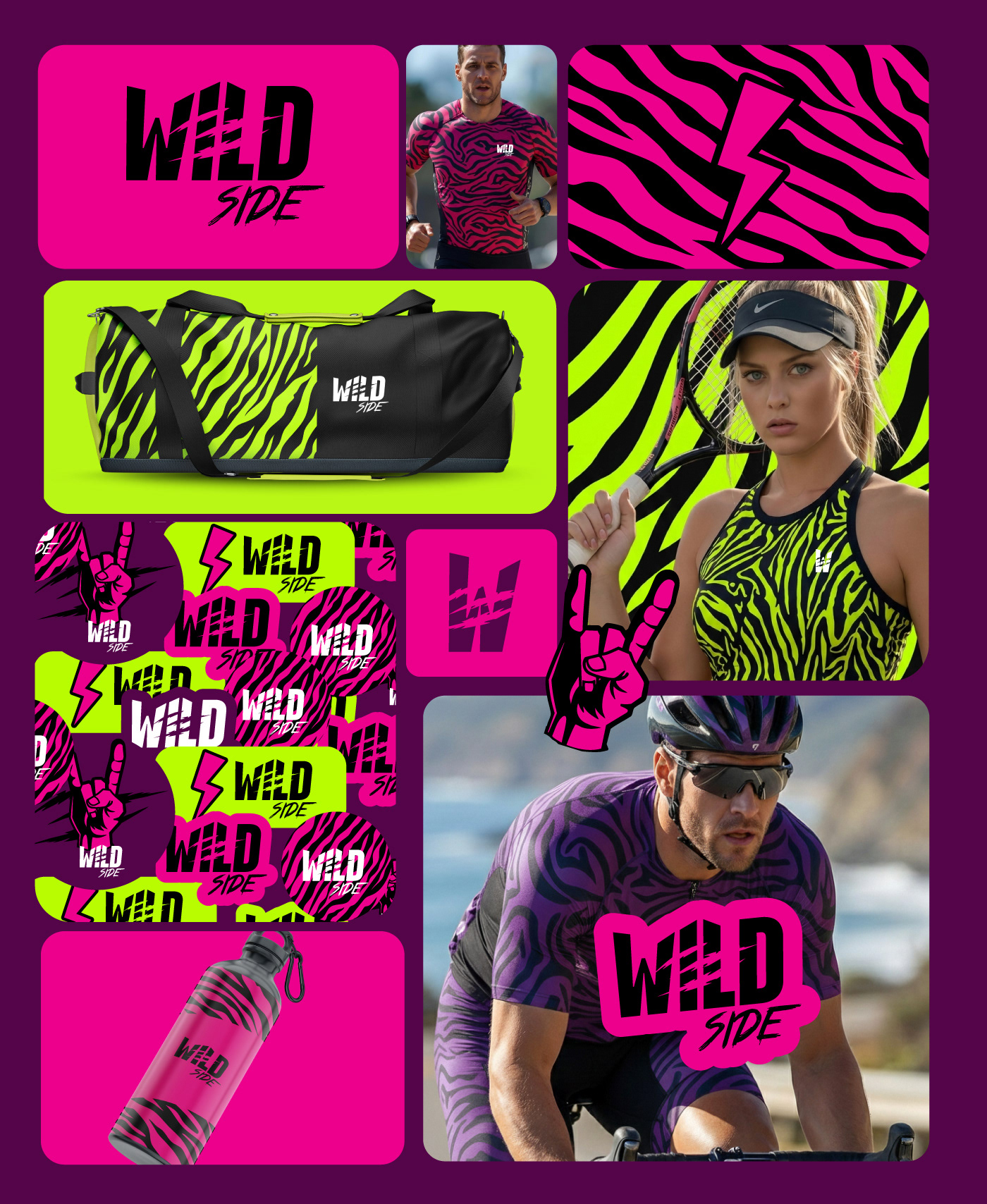
Todo mundo tem seu lado wild e rockstar.
A Wild Side existe para revelar essa força interior. Não se limita a modalidades, nem a regras prontas.
A paleta reforça essa narrativa por contraste e atitude, combinando profundidade, intensidade e ousadia em um sistema visual marcante, autoral e impossível de ignorar.
Todo mundo tem seu lado wild e rockstar.
A Wild Side existe para revelar essa força interior. Não se limita a modalidades, nem a regras prontas.
The Wild Side brand project is born from the connection between Brazil 🇧🇷 and the United States 🇺🇸, merging instinct, the open road, and attitude into a direct, no-compromise visual identity. The logo translates the brand’s DNA with strength, impact, and intentional tension. The heavy, compact uppercase typography delivers immediate presence, while the cuts in the lettering create movement, disruption, and raw energy—evoking action, friction, and a life lived in motion. Nothing is perfectly intact, and that is part of the language.
The color palette reinforces this narrative through contrast and attitude, combining depth, intensity, and boldness in a visual system that is striking, original, and impossible to ignore.
Everyone has their wild and rockstar side.
Wild Side exists to reveal that inner strength. It is not limited by disciplines or predefined rules.