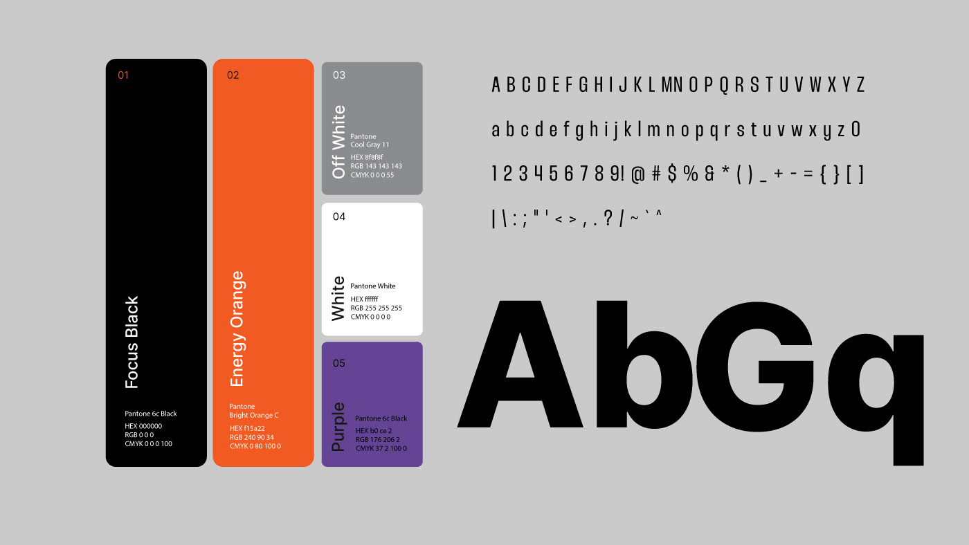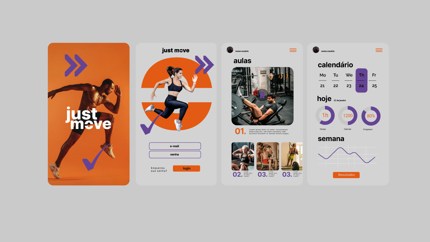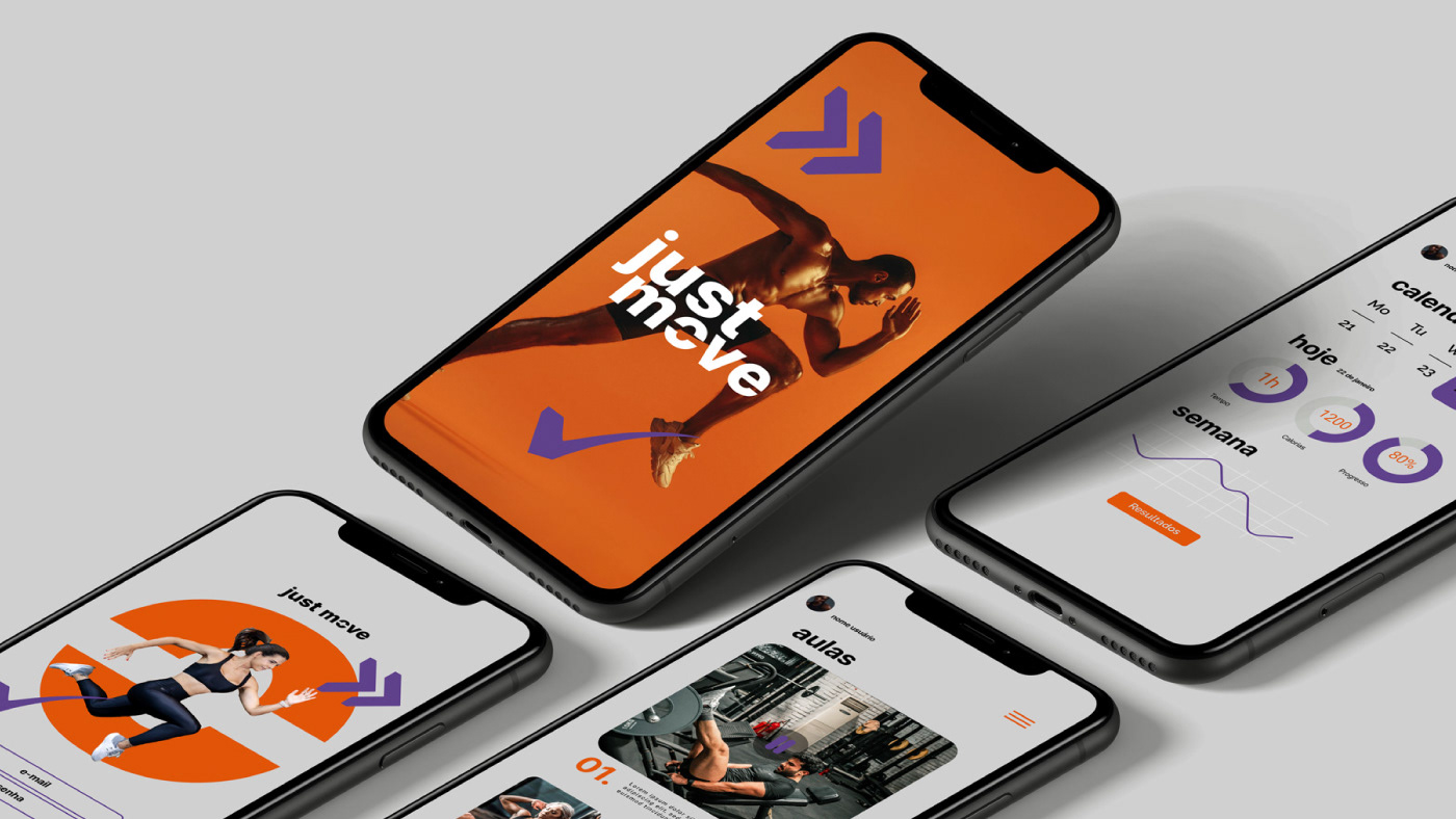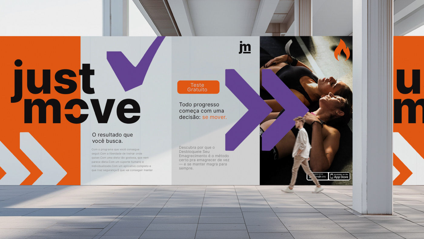
Projeto de rebranding e redesign da marca Just Move. A paleta equilibra força, energia e sofisticação: o preto sustenta autoridade e presença, o laranja traz movimento e direciona o olhar, o violeta adiciona inovação e tecnologia, e o off white cria respiro e equilíbrio, elevando a percepção da marca.
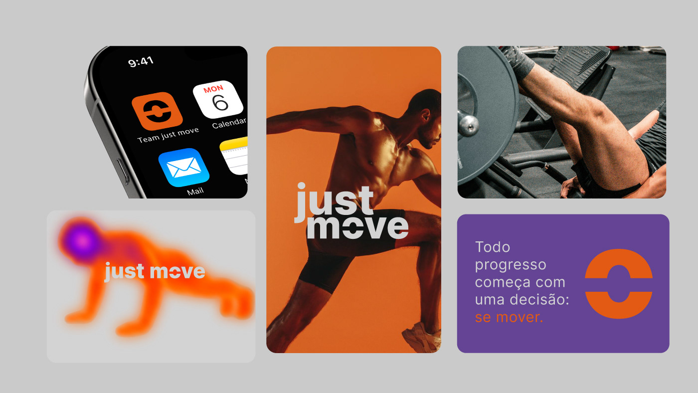
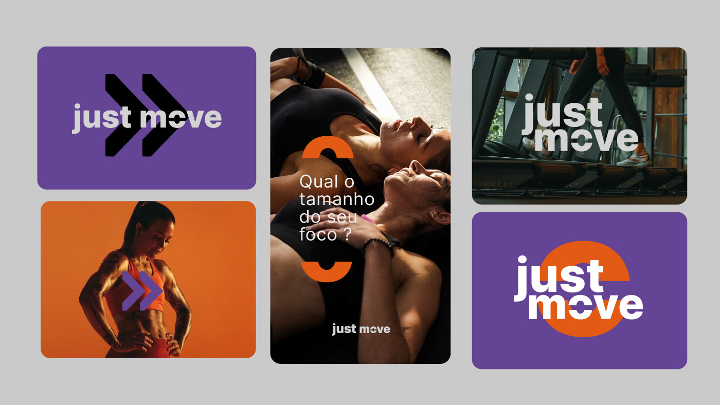
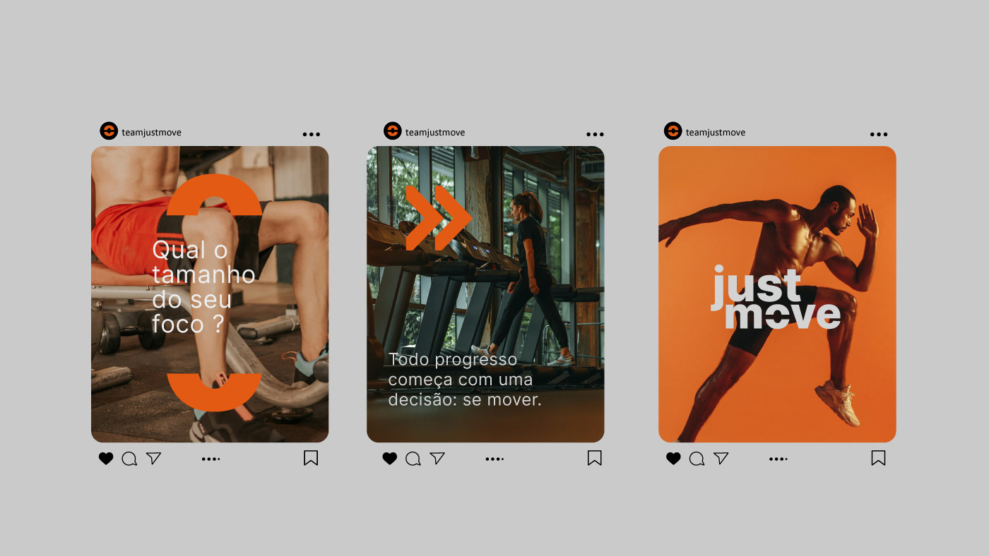
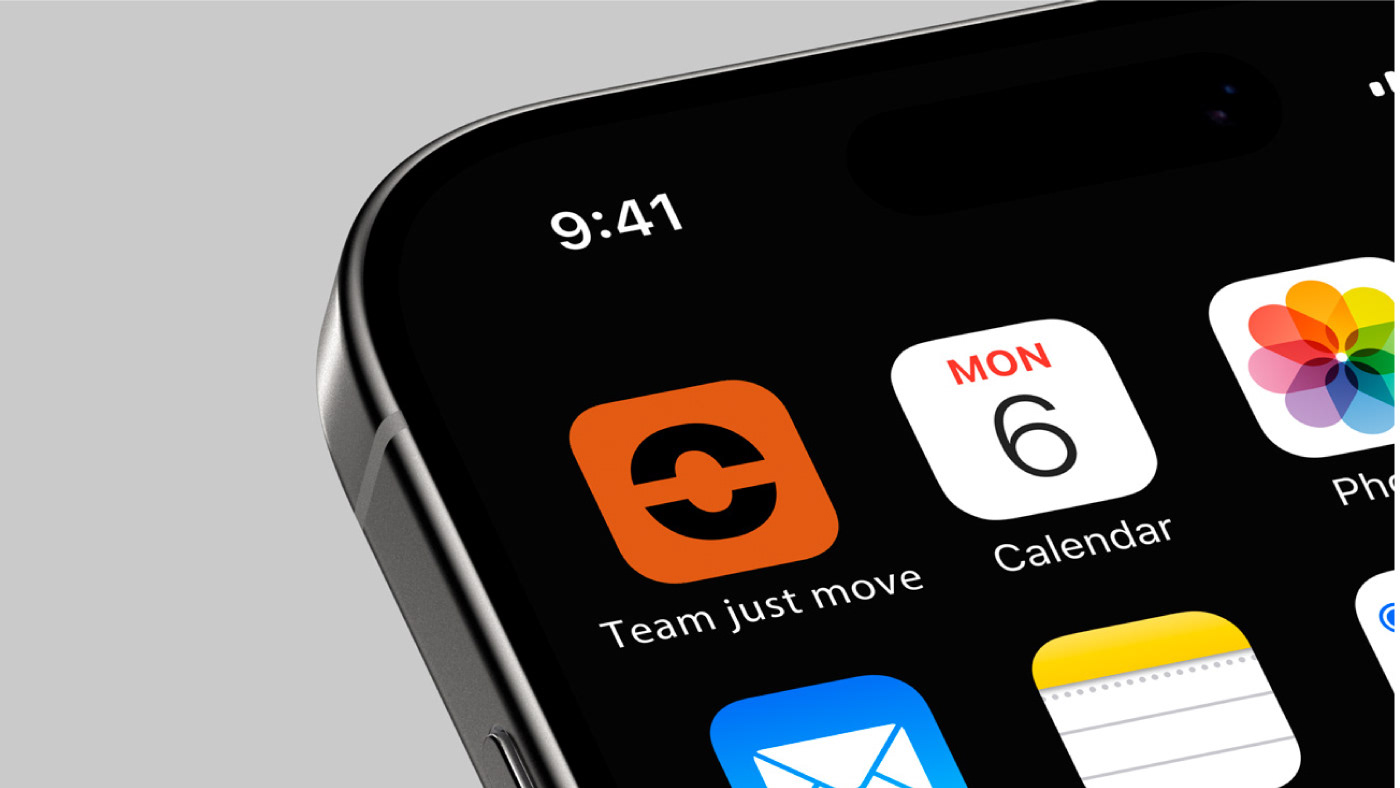
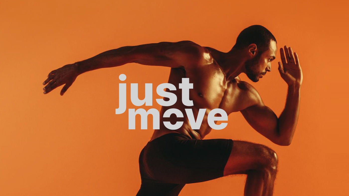
O logo traduz movimento com foco. O corte nas letras representa direção e precisão, eliminando excessos para concentrar energia no que importa: avançar. A tipografia robusta reforça força e intensidade, enquanto as minúsculas aproximam, trazendo um tom mais jovem, humano e contemporâneo.
O logo traduz movimento com foco. O corte nas letras representa direção e precisão, eliminando excessos para concentrar energia no que importa: avançar. A tipografia robusta reforça força e intensidade, enquanto as minúsculas aproximam, trazendo um tom mais jovem, humano e contemporâneo.
Rebranding and redesign project for the Just Move brand. The color palette balances strength, energy, and sophistication: black sustains authority and presence, orange brings movement and directs the eye, violet adds innovation and technology, and off-white creates breathing space and balance, elevating the brand’s perception.
The logo translates movement with focus. The cut in the letters represents direction and precision, eliminating excess to concentrate energy on what matters: moving forward. The robust typography reinforces strength and intensity, while the lowercase letters create closeness, bringing a younger, more human and contemporary tone.