Projeto de criação de naming, marca e identidade visual para a Guns Core.
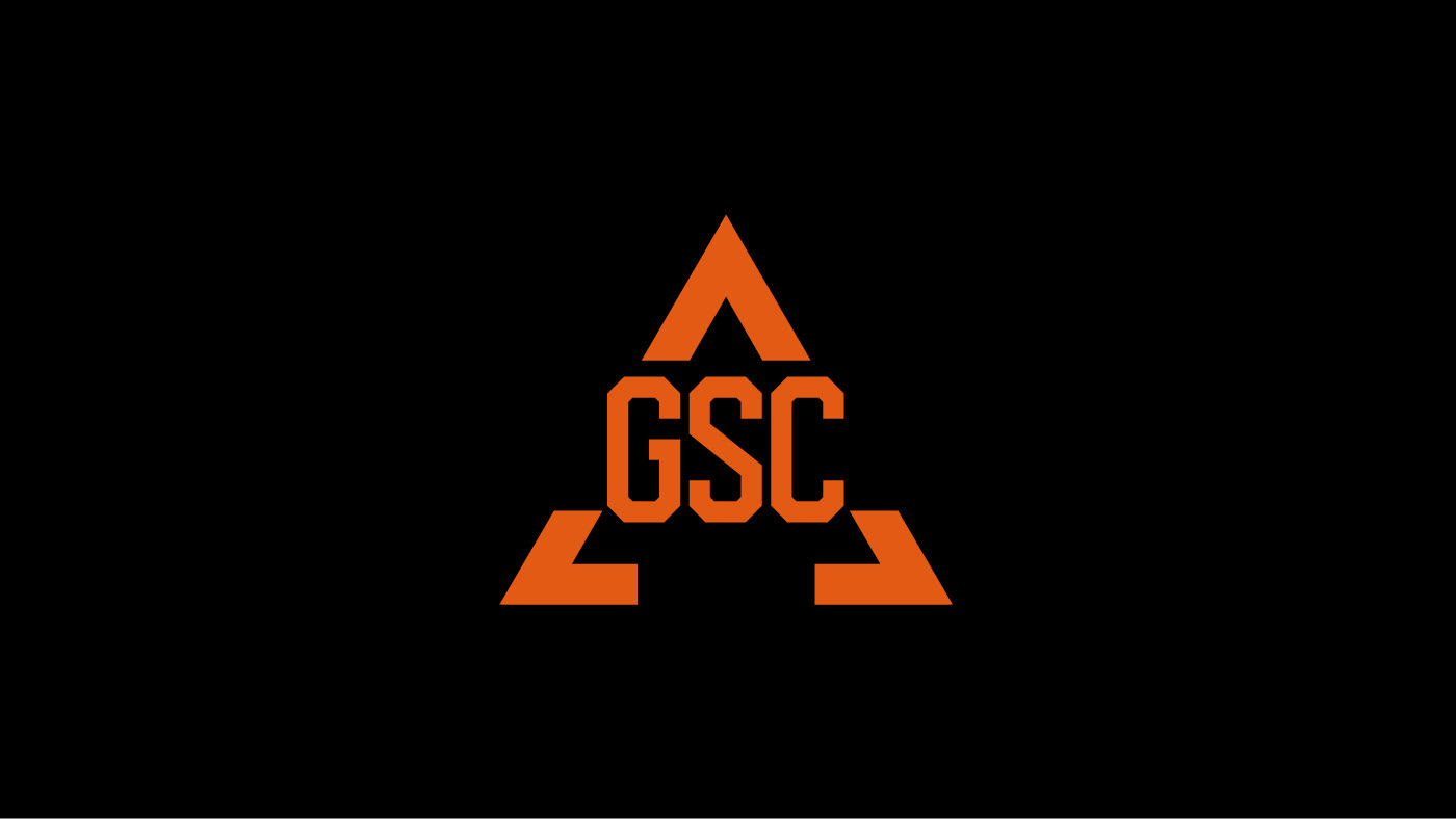
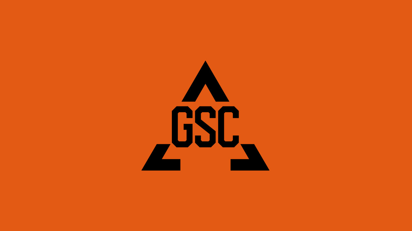
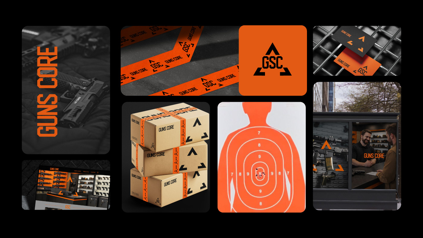
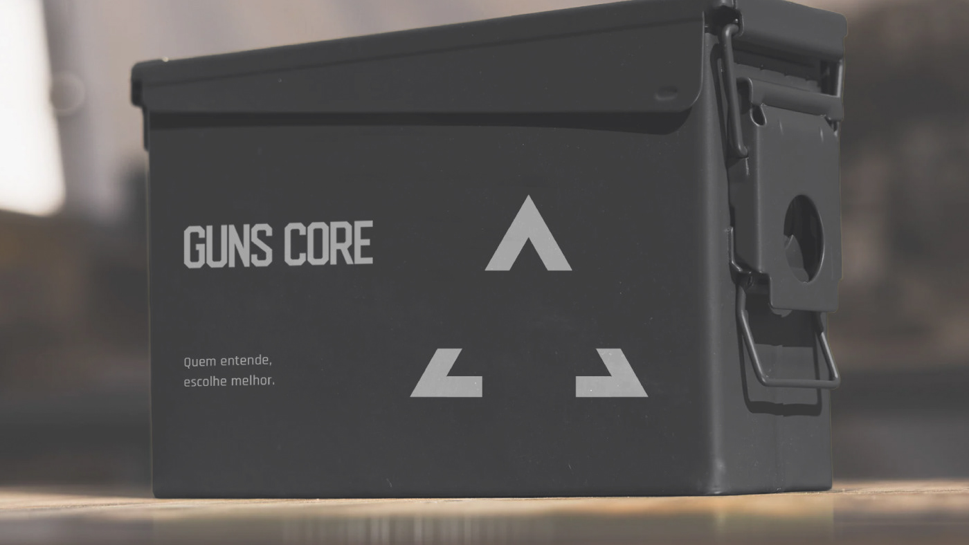
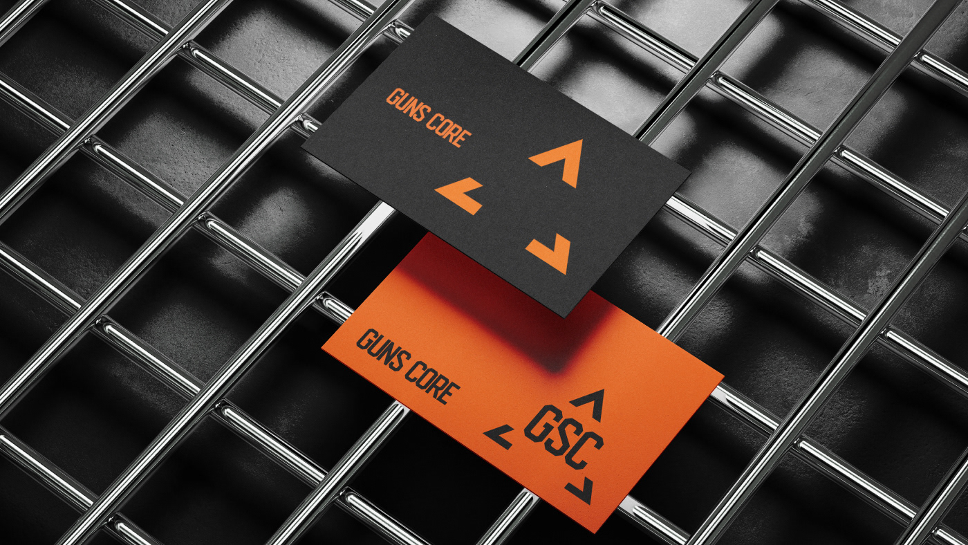
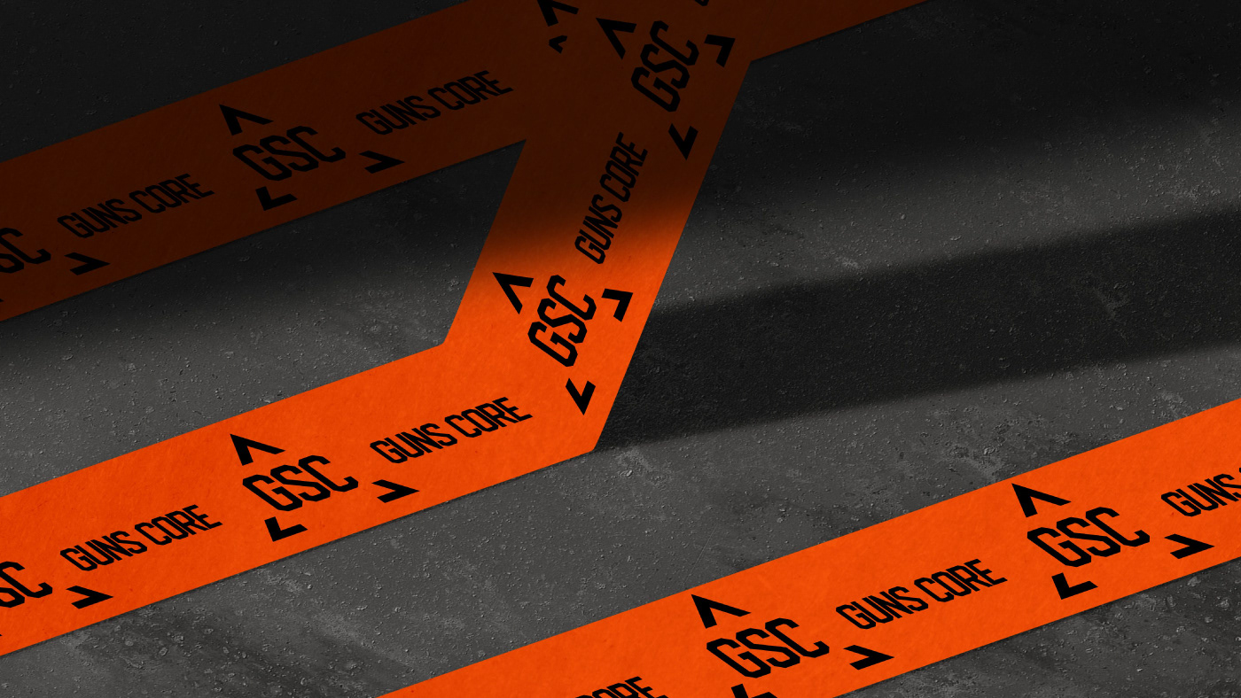
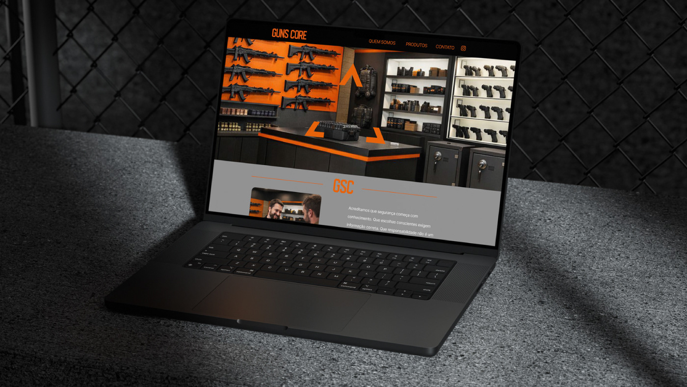
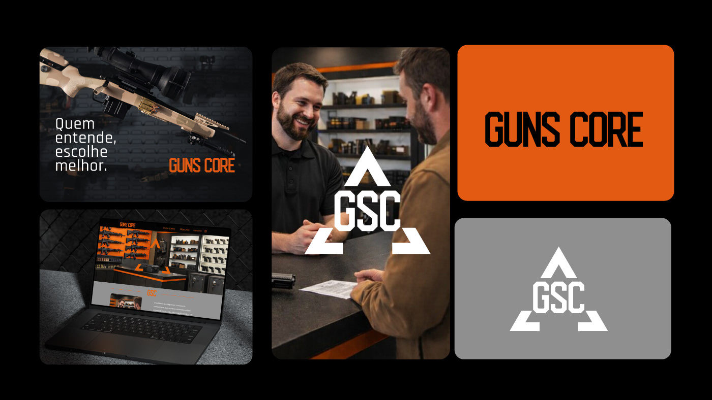
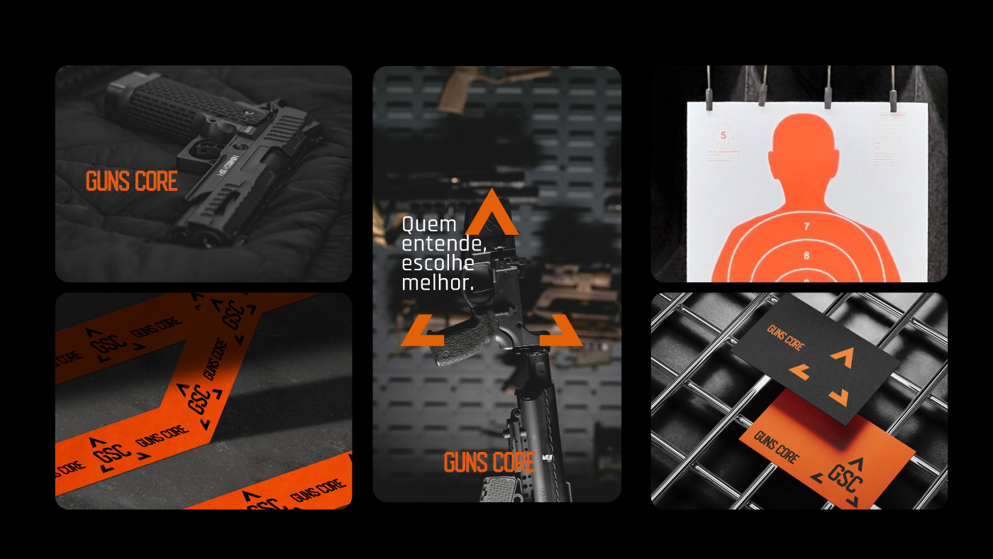
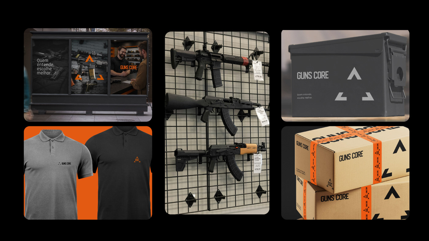
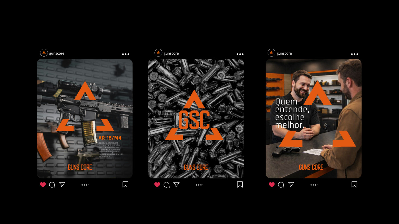
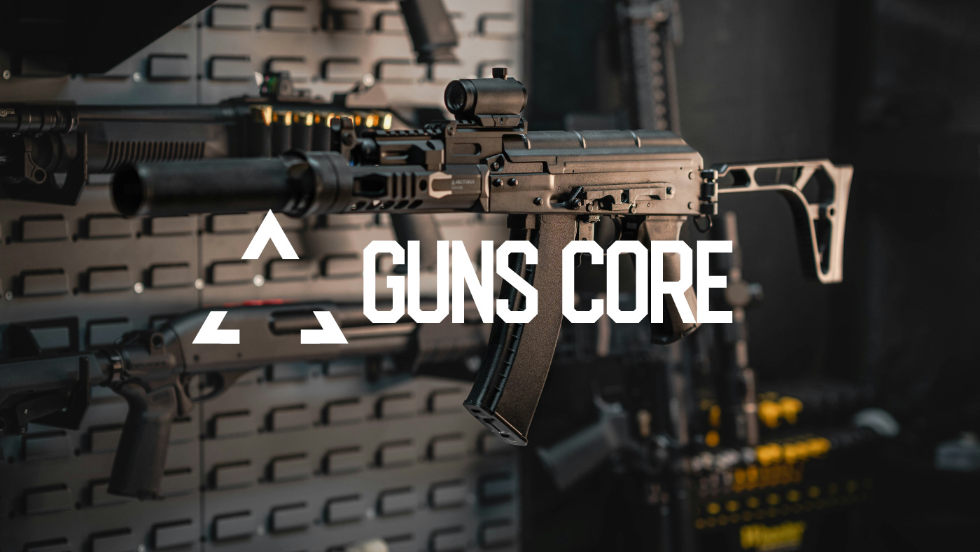
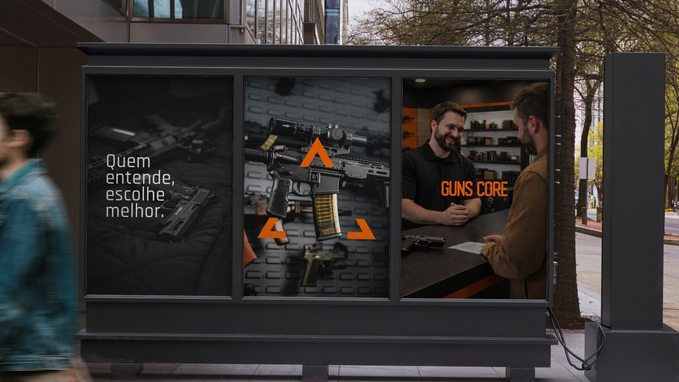
Guns Core comunica o núcleo de referência no universo de armas e produtos táticos. O nome nasce da fusão entre “guns” e “core”, posicionando a marca como o centro onde técnica, informação e responsabilidade se encontram.
O símbolo se inspira em marcadores táticos de orientação e enquadramento, criando um ponto central implícito que representa foco, precisão e decisão.
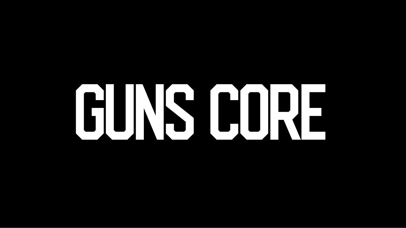
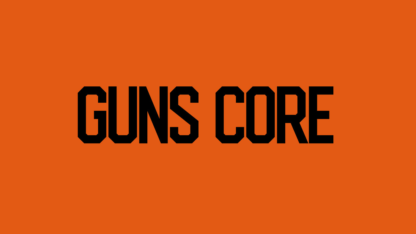
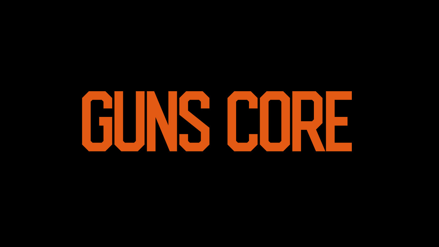
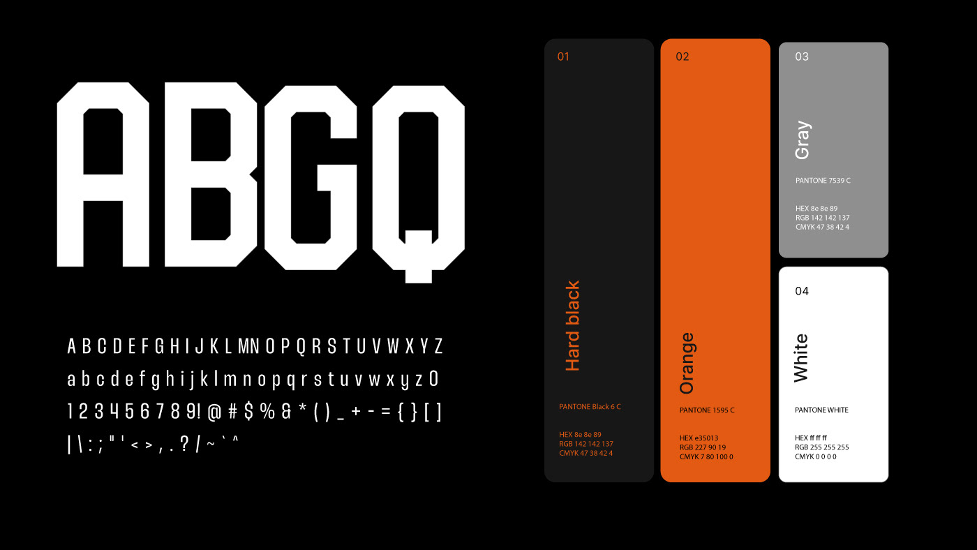
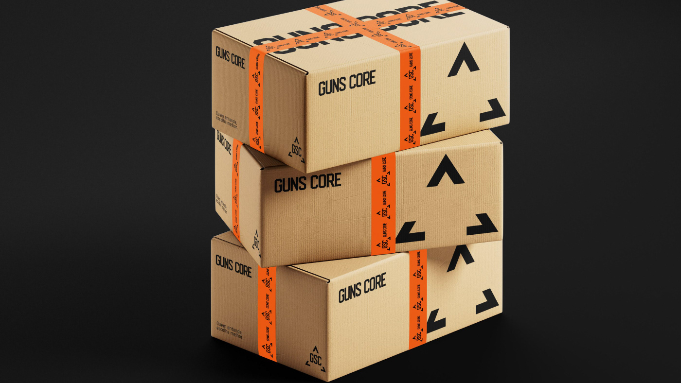
A identidade é reforçada pelo contraste entre preto e laranja, que equilibra autoridade, força e visibilidade, enquanto a tipografia robusta e angulada transmite estabilidade, presença e caráter operacional.
Project for the creation of naming, brand, and visual identity for Guns Core. Guns Core communicates the idea of a central hub within the universe of firearms and tactical products. The name emerges from the fusion of “guns” and “core”, positioning the brand as the place where technique, knowledge, and responsibility converge. The symbol is inspired by tactical markers used for orientation and framing, commonly found in targeting and operational interfaces. Its composition creates an implicit central point that represents focus, precision, and decision-making. The visual identity is reinforced by the contrast between black and orange. While black conveys authority, strength, and solidity, orange introduces visibility, alertness, and energy. Together, these colors balance presence and functionality within the tactical universe. The robust and angular typography completes the visual system, expressing stability, presence, and an operational character that aligns the brand with the technical and strategic environment in which it operates.
Guns Core comunica o núcleo de referência no universo de armas e produtos táticos. O nome nasce da fusão entre “guns” e “core”, posicionando a marca como o centro onde técnica, informação e responsabilidade se encontram.
O símbolo se inspira em marcadores táticos de orientação e enquadramento, criando um ponto central implícito que representa foco, precisão e decisão.
A identidade é reforçada pelo contraste entre preto e laranja, que equilibra autoridade, força e visibilidade, enquanto a tipografia robusta e angulada transmite estabilidade, presença e caráter operacional.
Project for the creation of naming, brand, and visual identity for Guns Core. Guns Core communicates the idea of a central hub within the universe of firearms and tactical products. The name emerges from the fusion of “guns” and “core”, positioning the brand as the place where technique, knowledge, and responsibility converge. The symbol is inspired by tactical markers used for orientation and framing, commonly found in targeting and operational interfaces. Its composition creates an implicit central point that represents focus, precision, and decision-making. The visual identity is reinforced by the contrast between black and orange. While black conveys authority, strength, and solidity, orange introduces visibility, alertness, and energy. Together, these colors balance presence and functionality within the tactical universe. The robust and angular typography completes the visual system, expressing stability, presence, and an operational character that aligns the brand with the technical and strategic environment in which it operates.